Analysis
You can produce reports within Pastoral filtering on your students' pastoral behaviour by selecting the analysis page.
Producing reports on our pastoral behaviour records
You can produce reports on your school’s pastoral behaviour records by selecting the Analysis page within Pastoral > Records > Analysis, including Supports. Students are listed in alphabetical order.
Graphs show totals for:
Incidents by time of the day
If you don’t change anything on the page, the graph default shows the number of occurrences of Problem Behaviour broken down by the time of day for the whole school, for the year to date.
You can also choose which time periods to display on the graph by selecting one/more of the coloured squares in the key at the bottom of the graph. If you move your cursor over a specific day, the number of Problem Behaviour occurrences for each time period will be displayed for that day.
Incidents by type
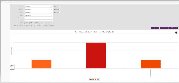
Select the 'by type' radio button and the ‘Display Graph’ button will display a graph showing the number of occurrences of the different Positive, Supports, and Problem Behaviour types and their Severity, for the whole school, for the year to date.
Problem Behaviour:
- type
- time of day
- location
- student
- monthly
Where the Severity for a Problem Behaviour is on record, this is indicated on the graph by different colours. If you move your cursor over the colours, the number of incidents for each Severity type will be displayed.
You can also choose which Severity types to display on the graph by selecting one/more of the coloured squares in the Severity key at the bottom of the graph.
To view the behaviour type graph for Supports or Positive Behaviour, select the relevant Behaviour radio button and click ‘Display Graph’.
Supports:
- type
- time of day
- student
- monthly
Positive Behaviour:
- type
- student
- monthly

For more, including customising the graphs:
-
Use the filters at the top of the page to select a specific ethnicity(ies); group, date range and/or gender.
-
Select the ‘Display Graph’ button to view the graph.
-
Hover over the 'i' tooltip for additional information
-
You can select a portion of the graph, zooming in for more details. When in zoomed mode, a 'Reset zoom' button is available.
-
You can print the graph and also export the data for the whole Pastoral Record to Excel. Deleted records will not be shown.
Looking for more answers? email support with your question.